Kristy Kelly
User Experience Researcher

The Project
Desktop and Mobile Website Redesign
My team at Sisu was tasked by Western Union to do a partial redesign of www.mywu.com, the home of their customer rewards program. A major business goal for the project was to add a new VIP rewards program to the site. We also saw it as an opportunity to improve user experience.
My contributions: UX research: usability testing, personas, analysis; UX design: design strategy, wireframes, prototypes, UX mentorship.
Technical: Responsive, CMS Wordpress, Angular application.
The Approach
As part of their business strategy to increase digital money transfers, our client gave us the design challenge to incorporate a VIP tier into the current My WU membership website.
Updating a single-page site sounded simple enough but there were some interesting challenges with the project:
The VIP program would launch as a trial in select markets: the design needed to be flexible to accommodate users in different markets, as well as have flexibility to be reversed.
The My WU site was to be merged with the main Western Union site in the future: we needed to work within constraints of the current site architecture. Some functionality like dynamic content, (to display VIP eligibility status) wasn't available until after the merger with main site. User accounts were also currently separate.
The membership program structure was complex and evolving: in-person-only Western Union members, online-only My WU members and customers in both programs. There were currently separate member id's for each program.
First thing we needed to do was better understand the Western Union ecosystem.
The Discovery
Our project Producer took us on a tour of the complex Western Union ecosystem so the Visual Designer and I could better understand how the My WU rewards program fits into the bigger picture. I introduced the team to a UX user story, to help us identify user types and goals. I also performed online secondary research to learn about the world of the remittance (money transfer) industry and customer loyalty programs.

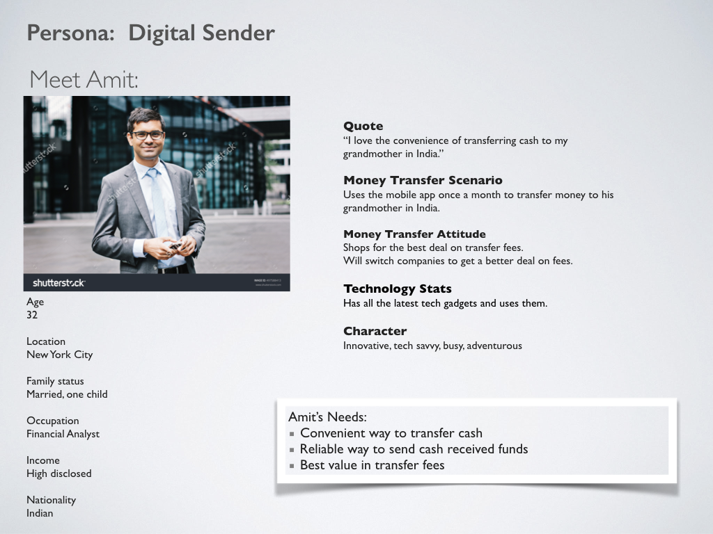
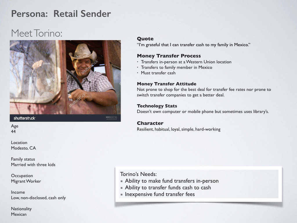
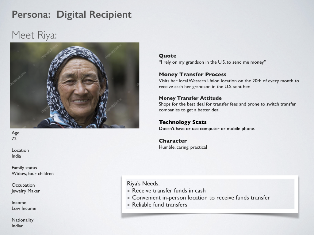
Personas
The online research I performed was helpful in identifying user behaviors. I learned that transfers performed by digital channels varied by remittance corridors. The US to India was a key corridor with more than 80% of the transfers being done online. Those customers were also the most likely to shop and switch to a competitor for lower transfer costs.
Based on the research, I created 'proto-personas' for several Western Union customers - The In-Person Sender, The Digital Sender and The Recipient. Amit, the Digital Sender, would be our primary inspiration for design.
Current site analysis
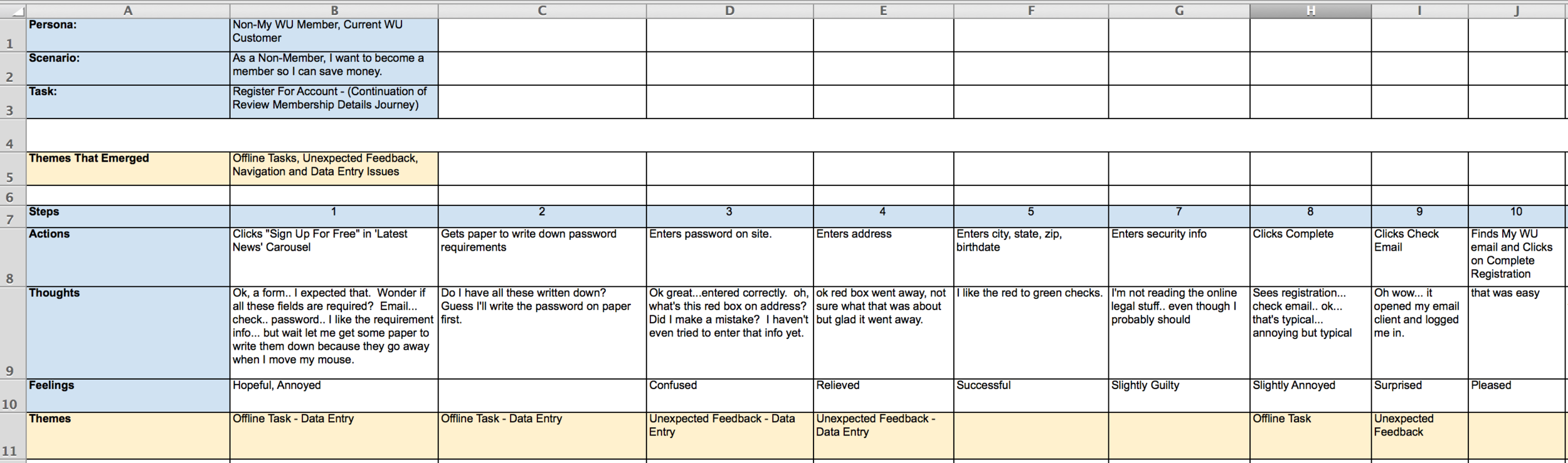
To become familiar with the site, I performed a task analysis for the existing site. As I stepped into the user's shoes and walked through the task, I noted my actions, thoughts and feelings at each step. This exercise helps identify pain points and opportunities for improvement.
Next, I identified themes that I saw in the task journey. Most of the themes that emerged were related to already known technical or process issues, like navigation issues and performing off-site tasks (like writing down a number). Other themes revolved around 'content mismatch', such as CTA's not matching the current user authentication state.
Below are images for the original website and my task analysis chart.


Task Analysis Chart
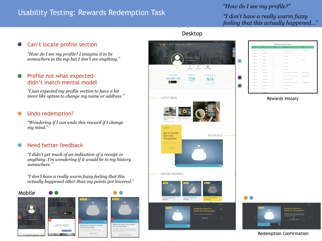
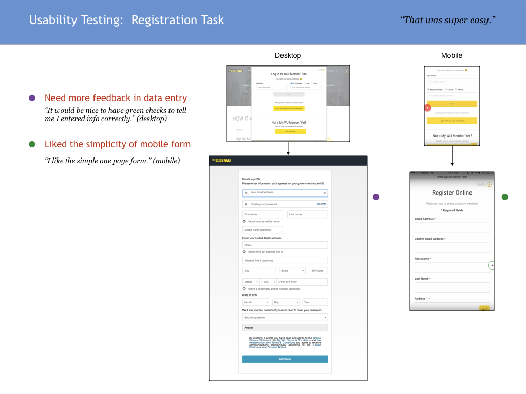
Usability Testing
Based on my task analysis, we decided to do a usability study to identify low-hanging fruit in the 'registration' and 'rewards redemption' process. We were also curious about first impressions of the site and initial thoughts about the rewards program. We conducted 2 moderated in-person sessions and 6 unmoderated remote sessions via usertesting.com. I wrote the test plan:


Results

The Framework
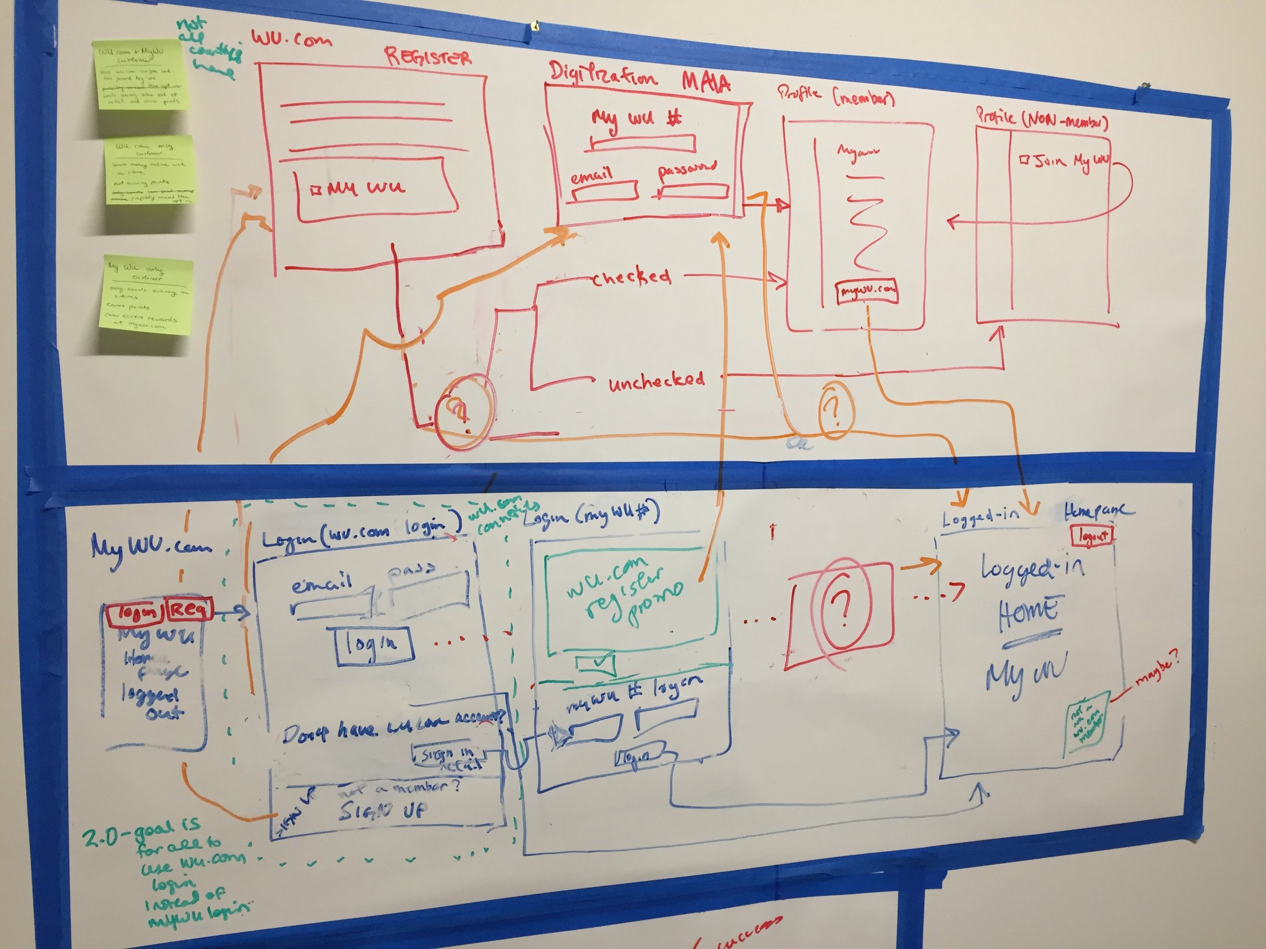
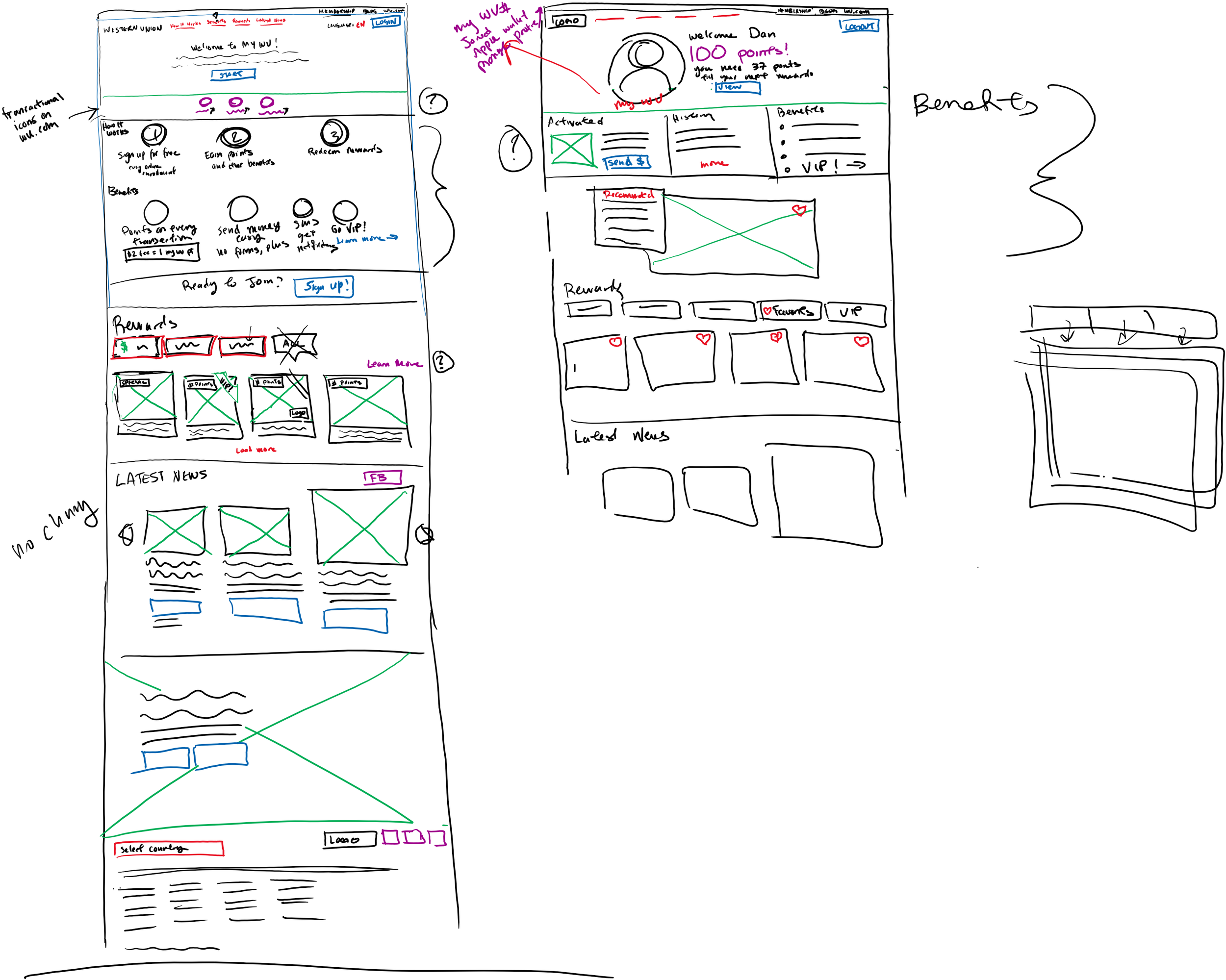
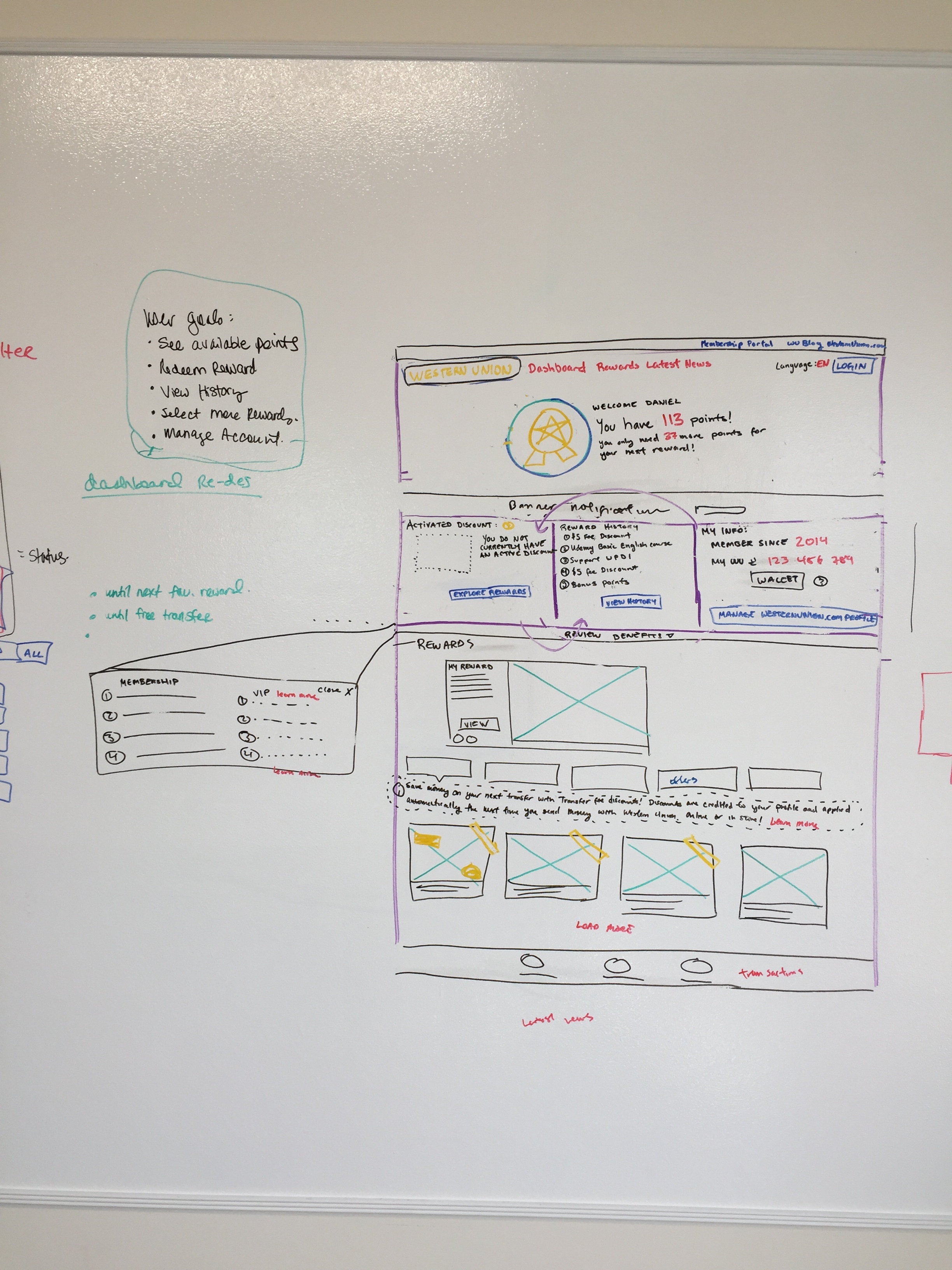
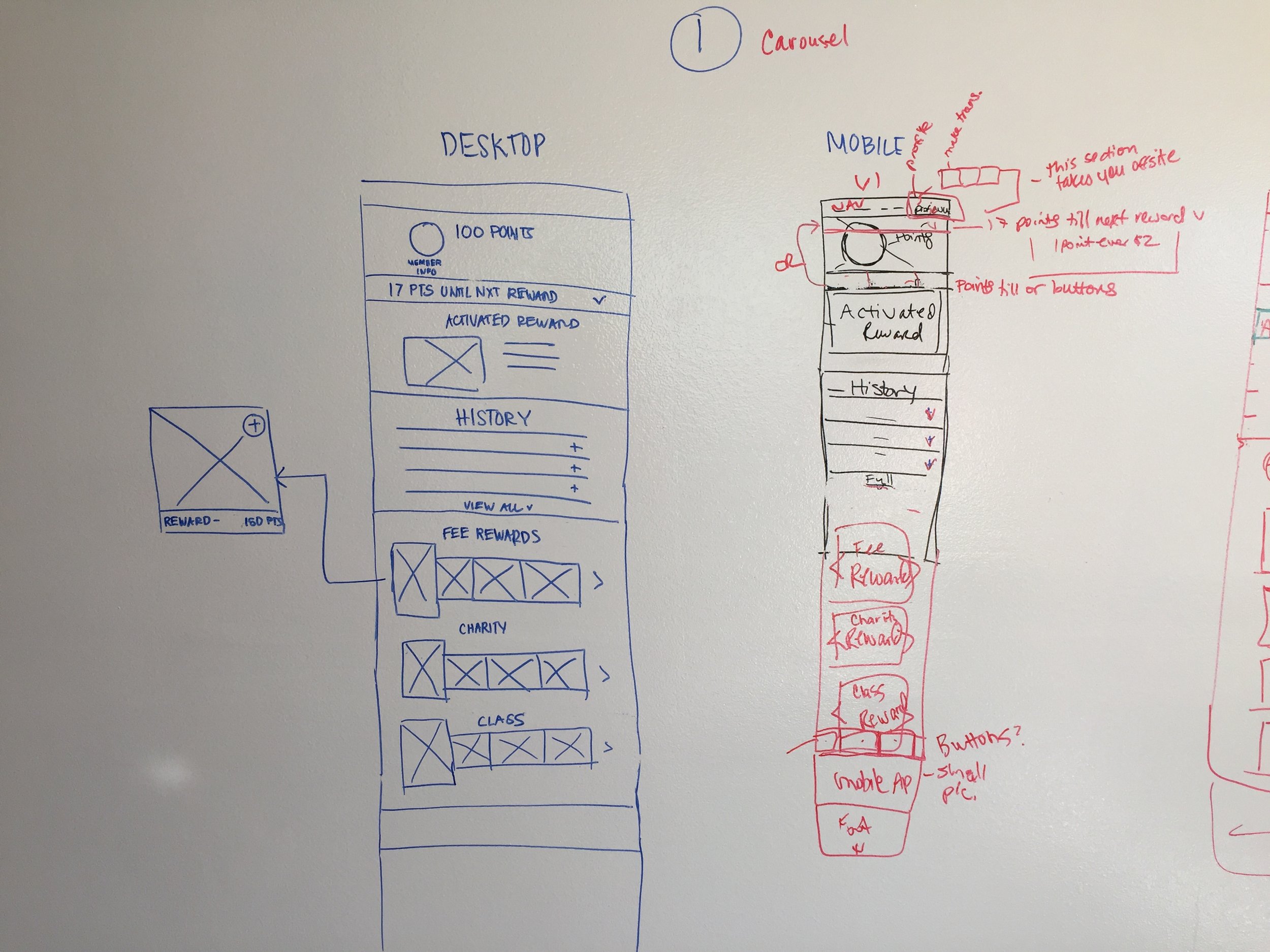
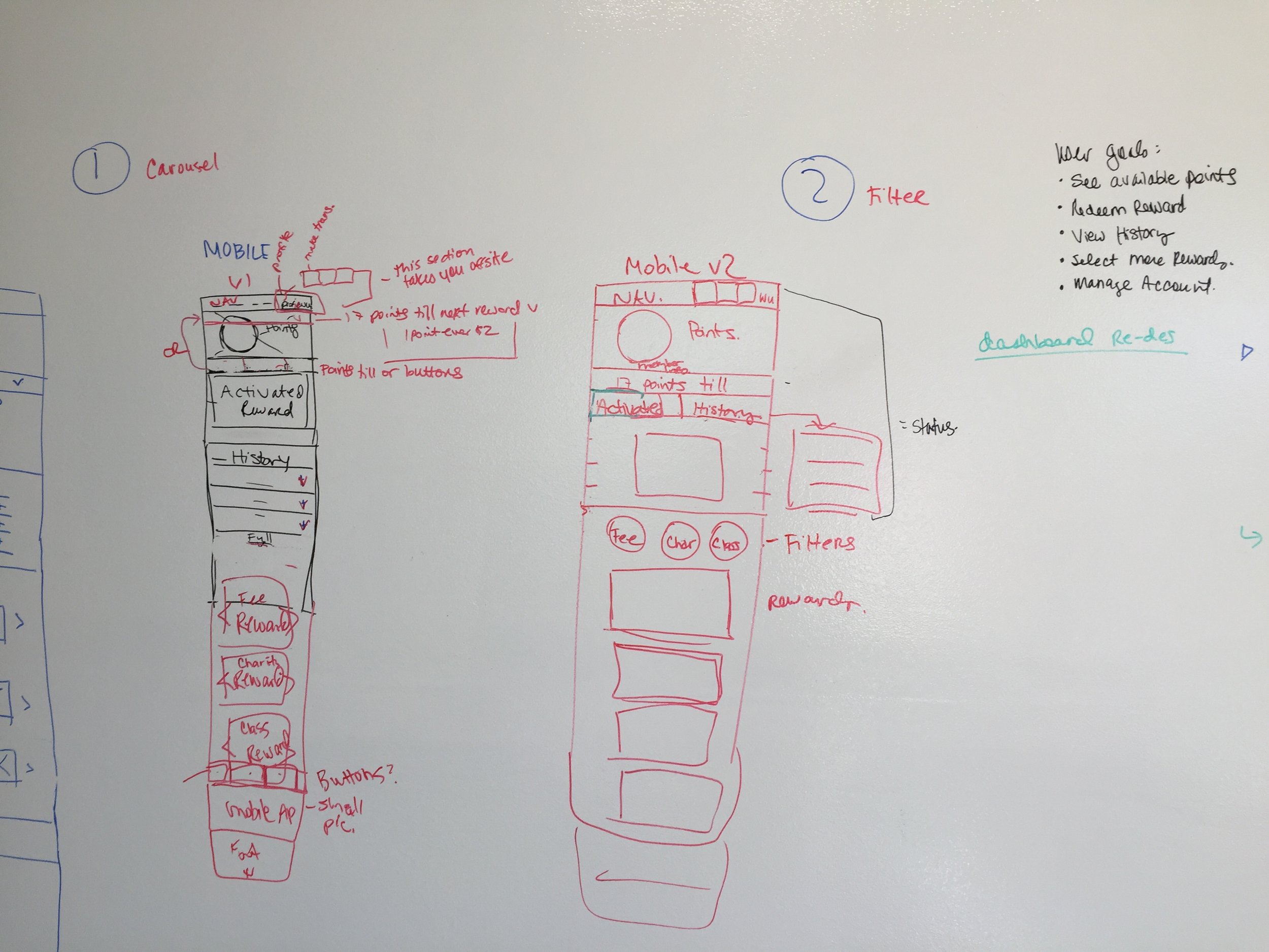
Whiteboard Wireframing
Based on our testing results, we decided to focus on two problem areas - the User Profile and the Rewards sections. Some of the discussions we had were around reducing page length, making the Profile items more discoverable, integrating VIP rewards into the Rewards module and displaying points and eligibility status.
The Design Refinement
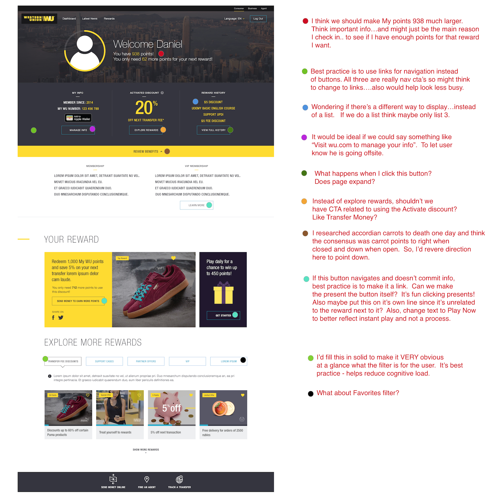
After the whiteboard wireframing session, the visual designer created design comps. I assisted her by creating a quick mockup for the rewards module, providing UX critique and UI inspiration examples and documenting client feedback.


The Results
After several rounds of critiques and revisions, we had our final designs to give to our client for implementation.


The End